
As a sports brand in a competitive market, FOX Sports wanted to offer a user experience that really resonated with its users. To do that, we spoke to users and discovered their favorite team is what they’re truly passionate about. So we focused on the fan’s teams and flattened the UX by bringing key information, like live game headlines and stats, directly onto the scoreboard. We also made it easier to get around the app by simplifying the navigation. Plus, we added best-in-class notifications to provide value beyond just browsing the app.
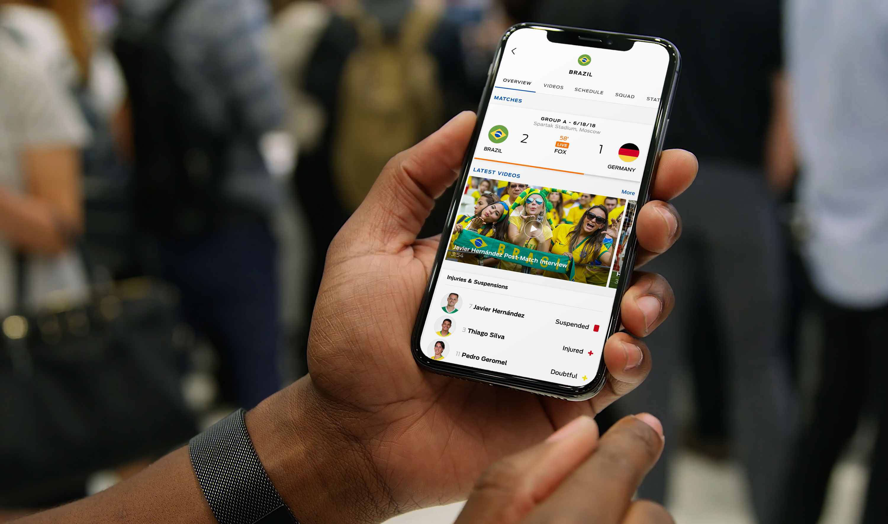
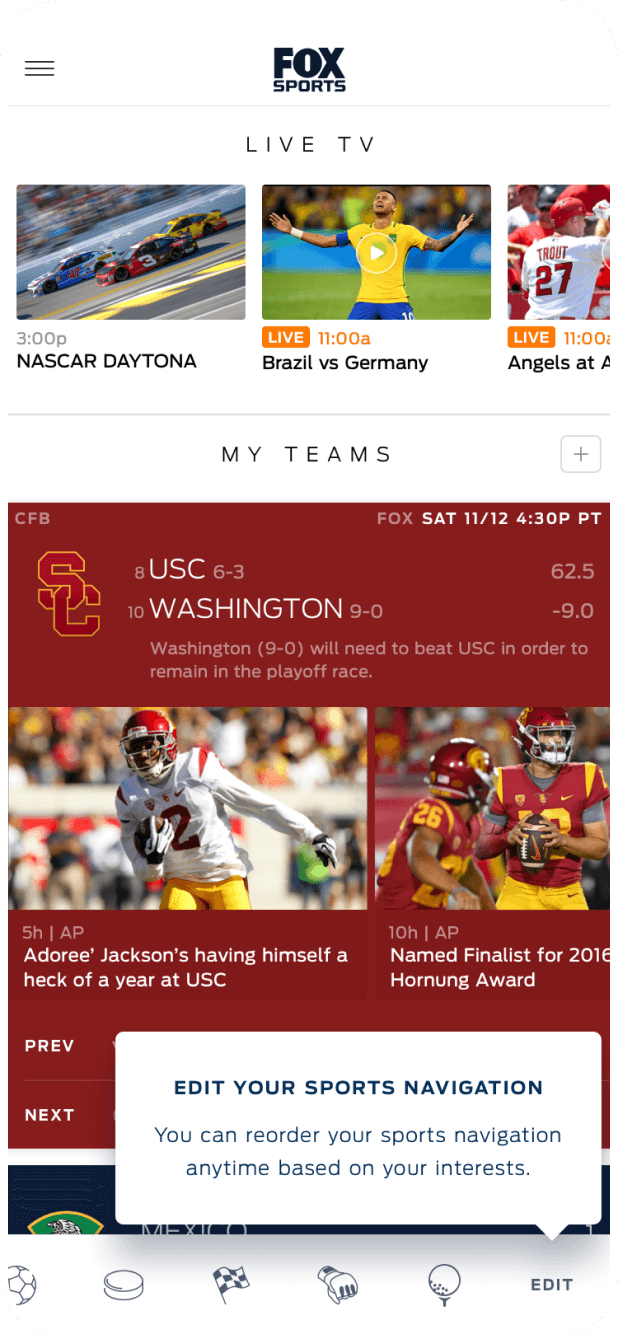
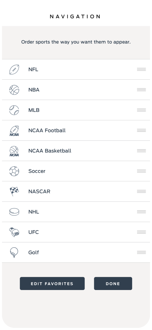
We improved the user experience by offering customizations tailored to each person’s unique interests. We employed a ‘hero’ design treatment for the user’s favorite teams to create a deeper emotional connection. We also provided more detailed information on the scoreboard for games featuring the user’s favorite teams, and included attractive and effective prompts for personalization. Furthermore, we gave priority to the user’s favorites on all screens and enabled them to easily select and reorder the main navigation items.
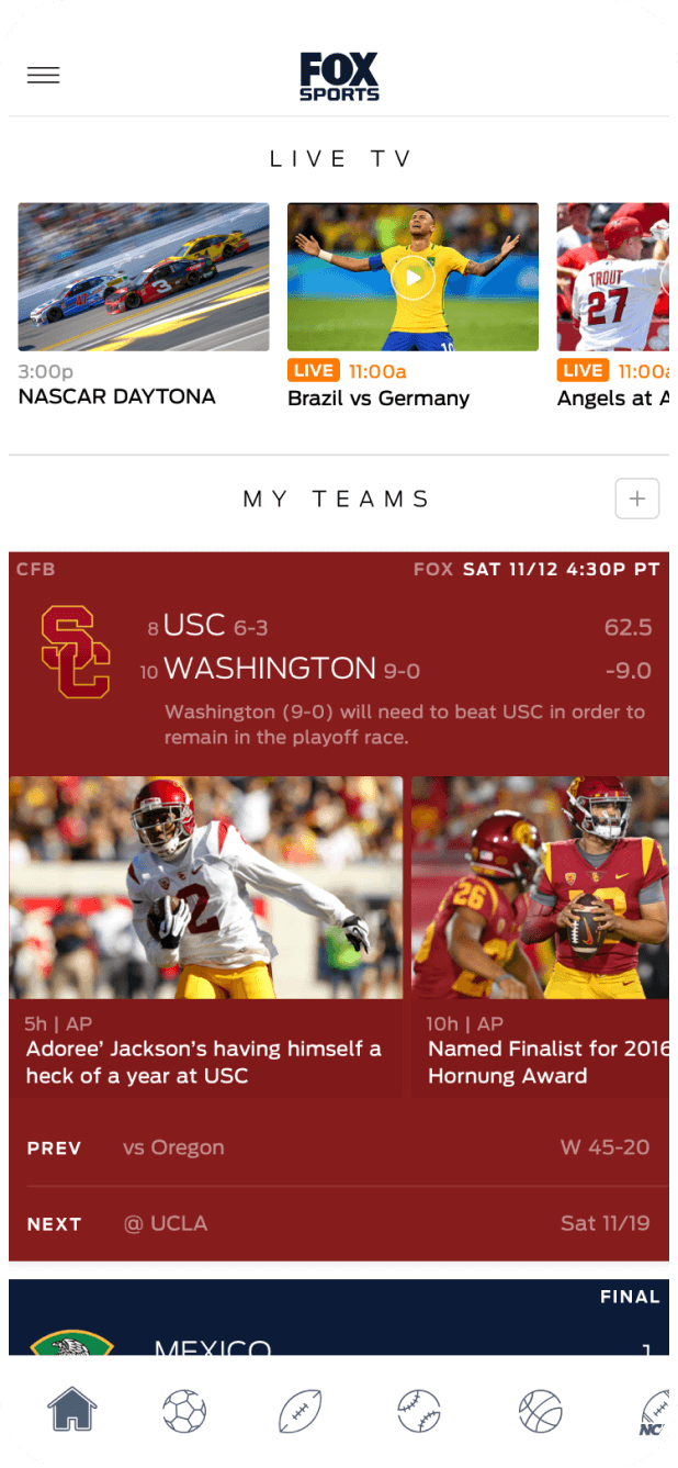
How did we make it easy for users to access live streaming within the sports app? By integrating it seamlessly into the core user experience, rather than having it exist as a separate mode. One way we did this was by adding a streaming carousel at the top of the homepage, which allowed users to quickly access live programs and promoted them to all users without disrupting their other activities. We also incorporated the top upcoming event on the homepage to increase awareness and drive engagement. Finally, we integrated visually rich calls to action on scoreboards for events that were available to stream, along with any related shoulder programming.
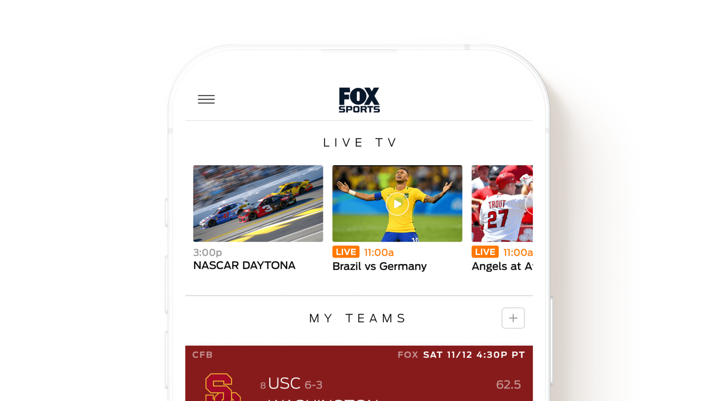
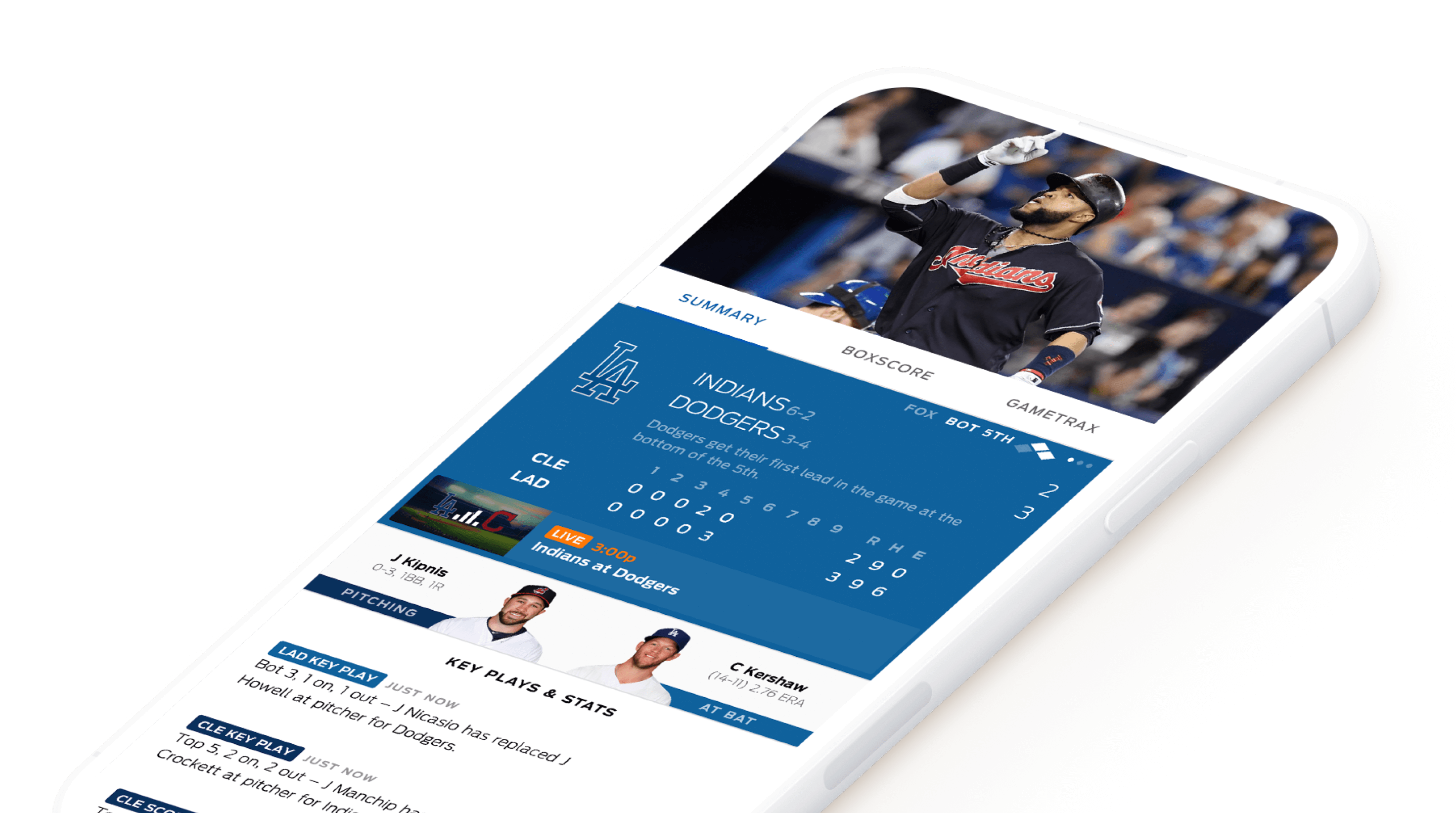
We kept users engaged with video content by allowing them to access other features concurrently, both within the app and on their device. To achieve this, we integrated auto-play portrait video into all event screens—Summary, Box Score, Videos—to expose related event content. We also incorporated the player function into Shows and Highlights screens to make playlisting easier. Additionally, by leveraging the operating system’s picture-in-picture functionality, users were able to multitask while continuing to stream the video. These features address common challenges and extended user engagement with the video content.
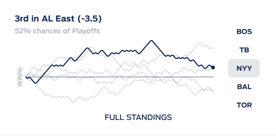
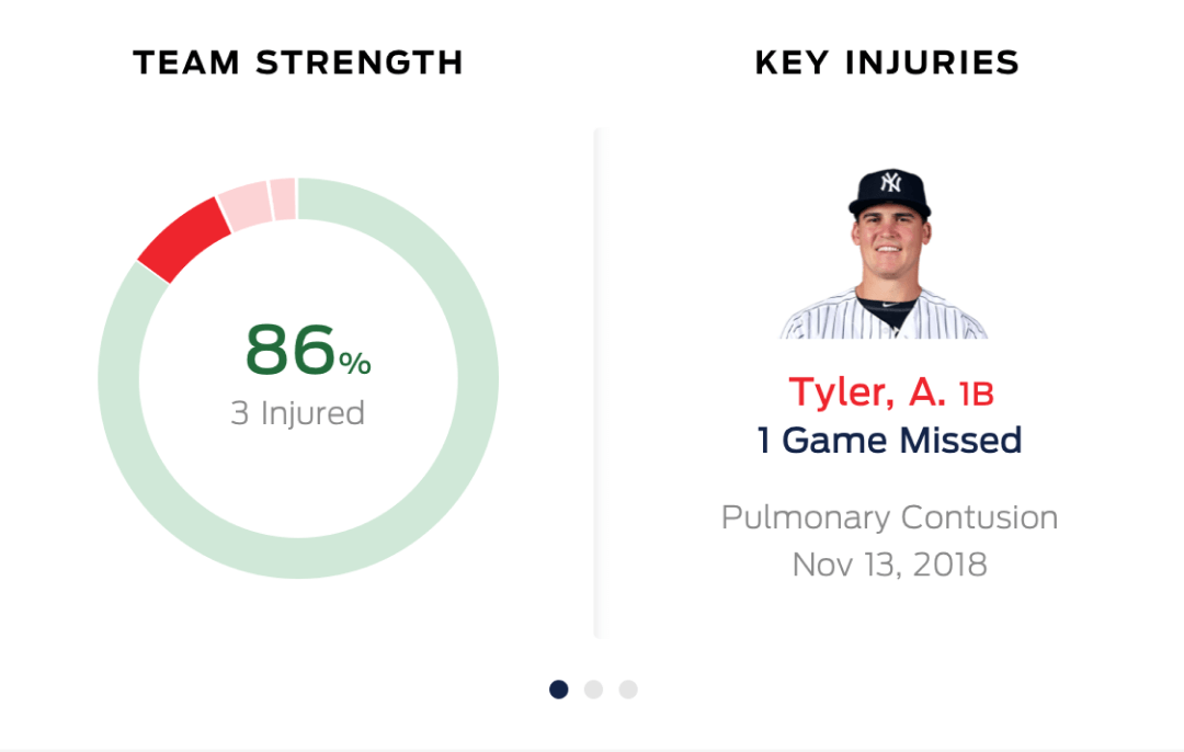
How did we make our sports app’s team pages stand out? By delivering an improved and differentiated experience that truly captured the essence of each team. One way we did this was by offering a Team Home experience that acted as a ‘dashboard,’ providing unique insights into the team’s season narrative beyond just a conventional ‘snapshot’ perspective. We also created unique interactive ‘widgets’ that encouraged users to explore key aspects of the team’s season narrative in greater depth. Additionally, we provided multiple points of entry to the team pages, such as from the homepage, scoreboards, and standings. By addressing these challenges, we were able to create a truly memorable and engaging experience around our app’s team pages.



Designing the Fox Sports app required a significant amount of effort but was an incredibly rewarding experience. The process of speaking with sports fans and uncovering new insights to create a better app was truly enjoyable. Each sports fan has their own unique preferences, varying levels of interest in data, specific sports leagues and favorite teams.