
I was tasked with improving the usability of FOX Now, a premium streaming platform that offers a variety of popular and award-winning TV shows, movies, and live sports from studios such as Fox, FOX Sports, FX, and NatGeo. Through qualitative user testing, we identified issues with the current navigation system and set out to create a streamlined experience that allows users to easily access their desired content and discover new favorites to binge-watch. The goal of the redesign was to make it simple for users to find and enjoy the wide range of video offerings available on FOX Now.
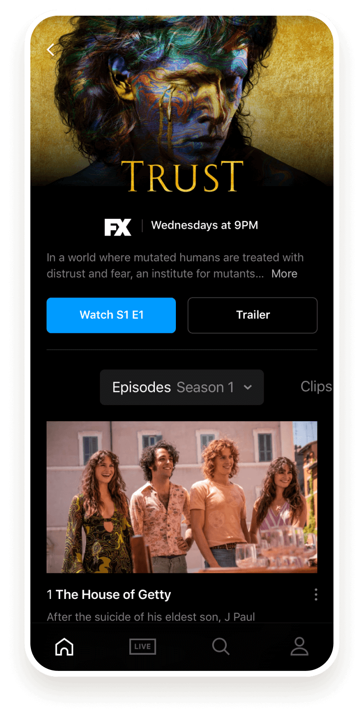
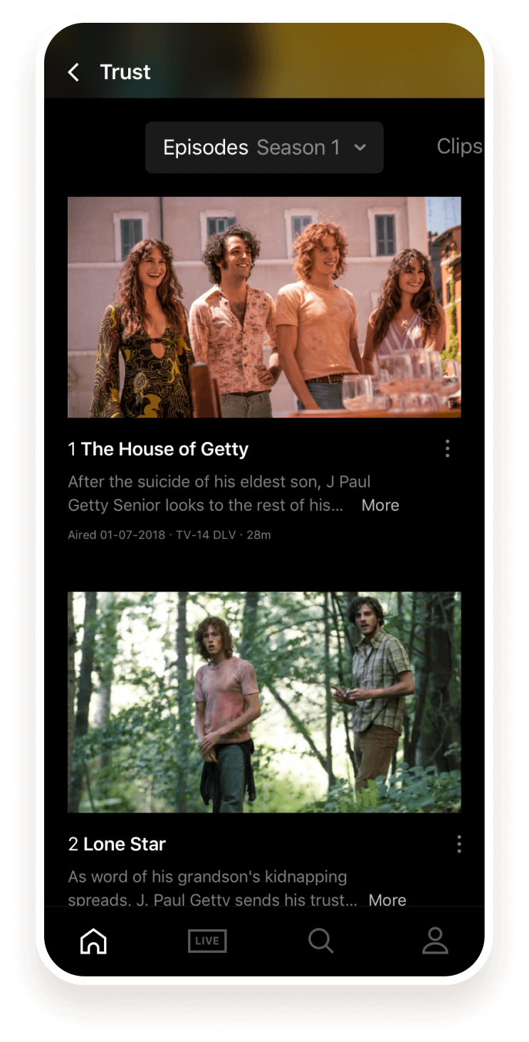
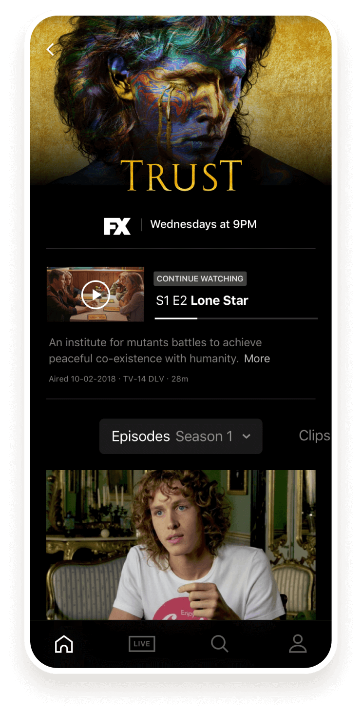
User testing revealed that the series detail page had several usability issues that made it confusing for users. The ‘watch’ button was located below the fold, the ‘season’ selector was hidden until the top of the page was scrolled to, and the option to watch the video was combined with the ‘share’ option in a pop-over menu. These issues made it difficult for users to understand how to access and view the content on the page.
To improve the user experience on the series detail page, we implemented the following features: a clear and concise information hierarchy, high-quality images and trailers, intuitive controls, and a clean, user-friendly design.

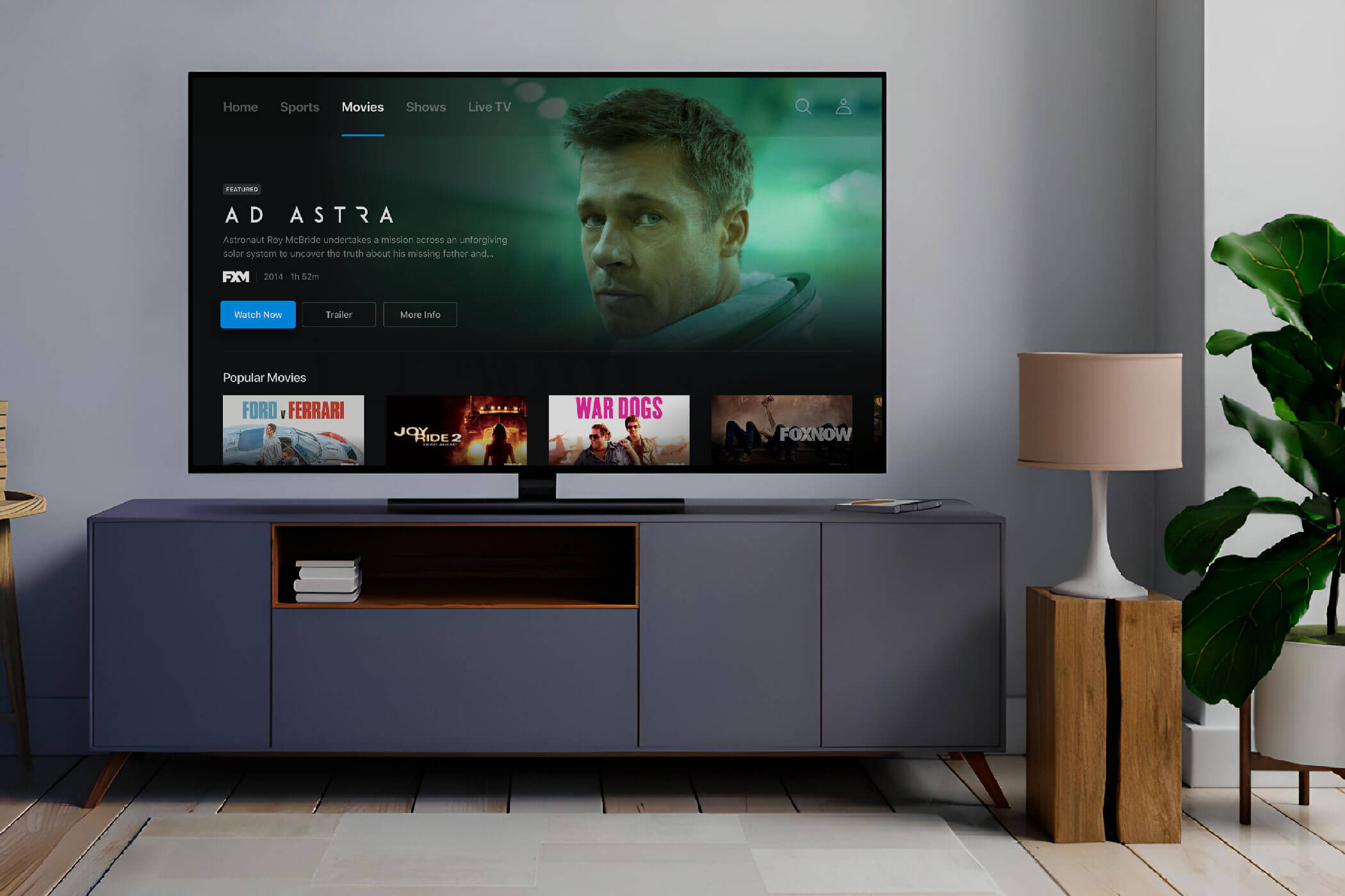
Users reported difficulty in finding content to view and rarely discovered the swipe-left functionality that revealed additional content sections. The content was organized primarily by studio, which kept it siloed but made it difficult for users to discover new content. As the promotion of new content is a key component of the entertainment industry, it is important to engage users with new content, while efficiently serving content such as “recently viewed.”
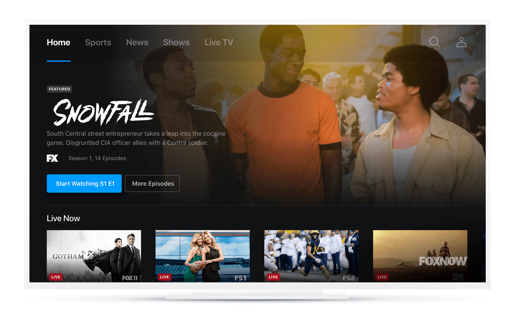
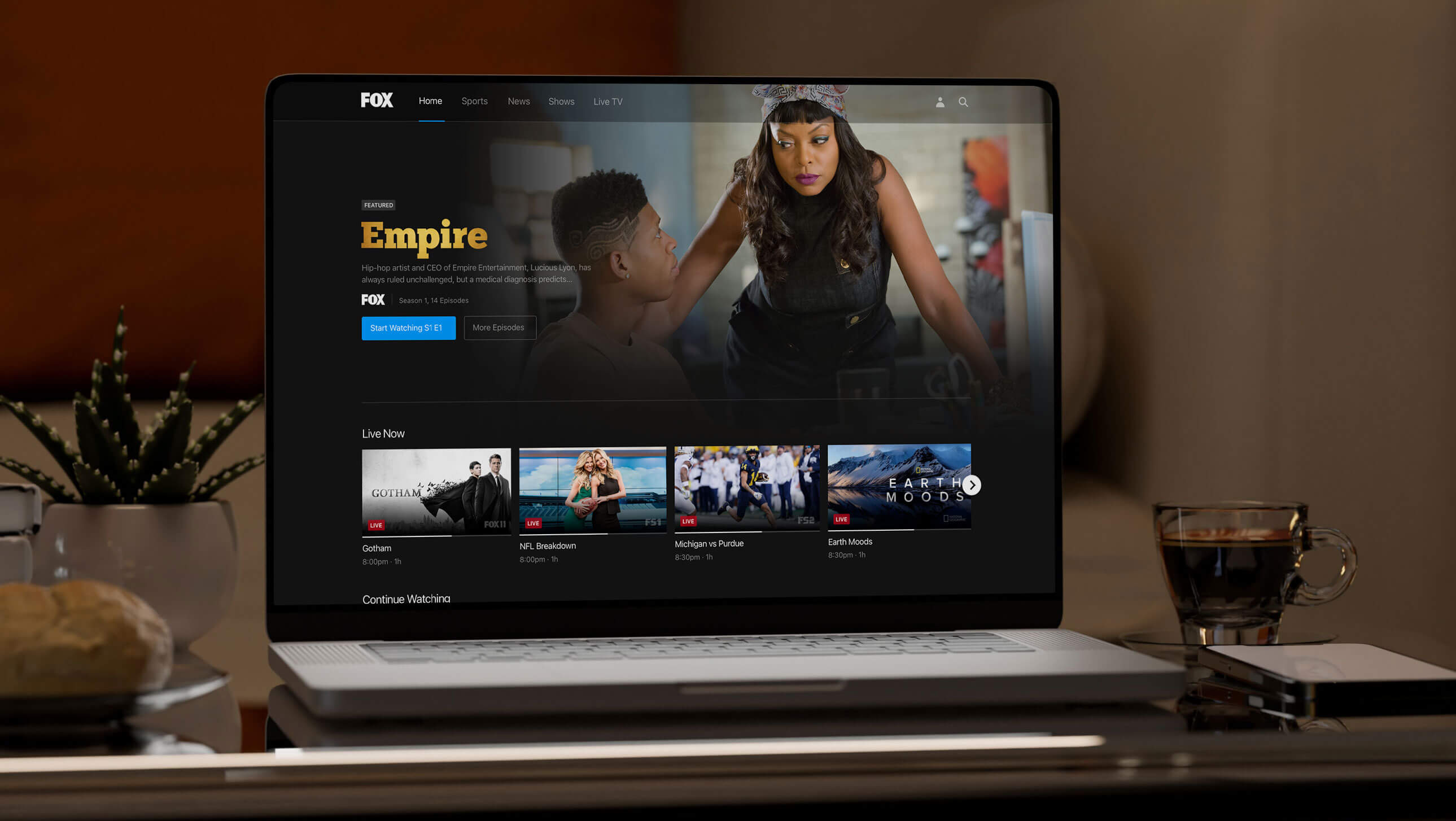
To clarify the content structure, category navigation was added and content was reorganized based on card-sorting research. A promotion area was also created to highlight new content and must-see live events. As live video is a key part of the Fox business, the “Live Now” carousel was added, proving particularly valuable for sports fans. Another aspect of improving the watch and discovery experience included fine-tuning curated collections for better personalization based on the user’s viewing history.
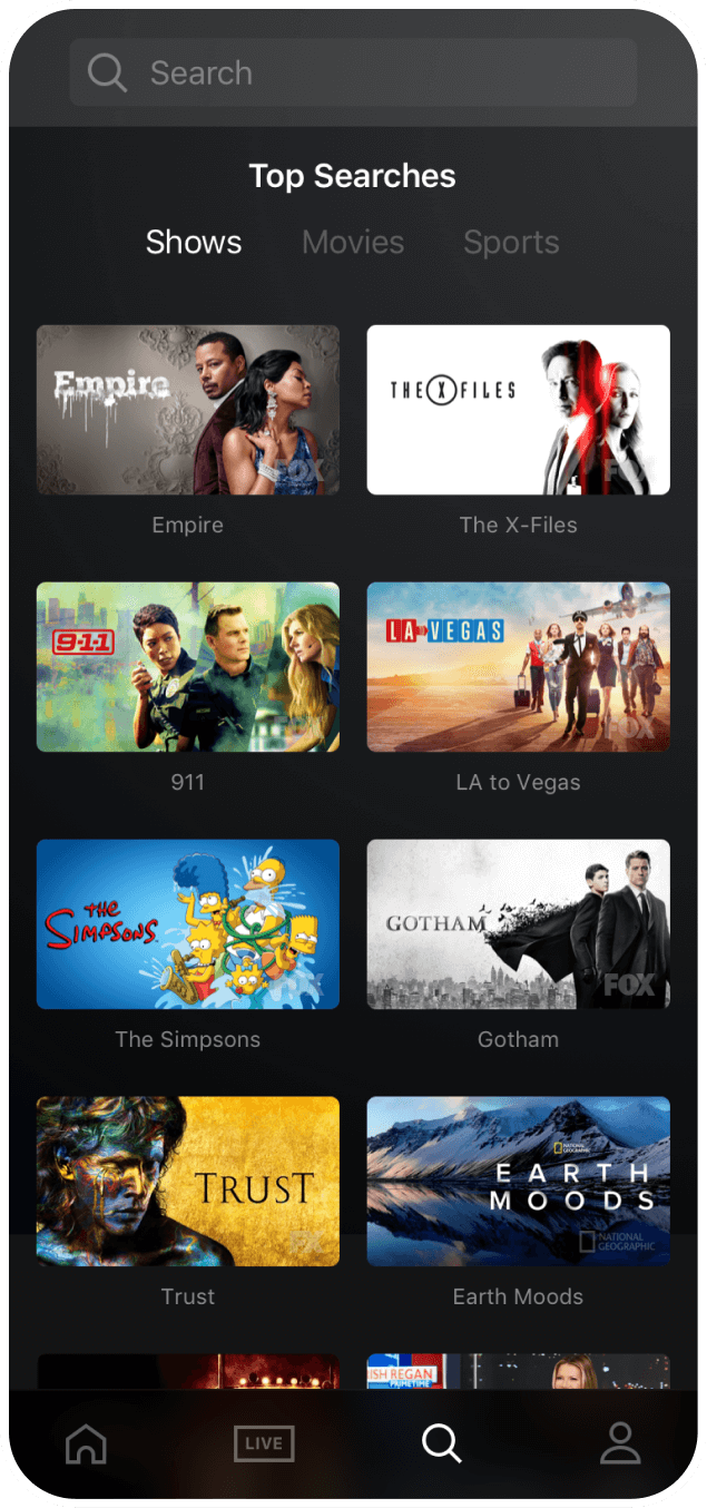
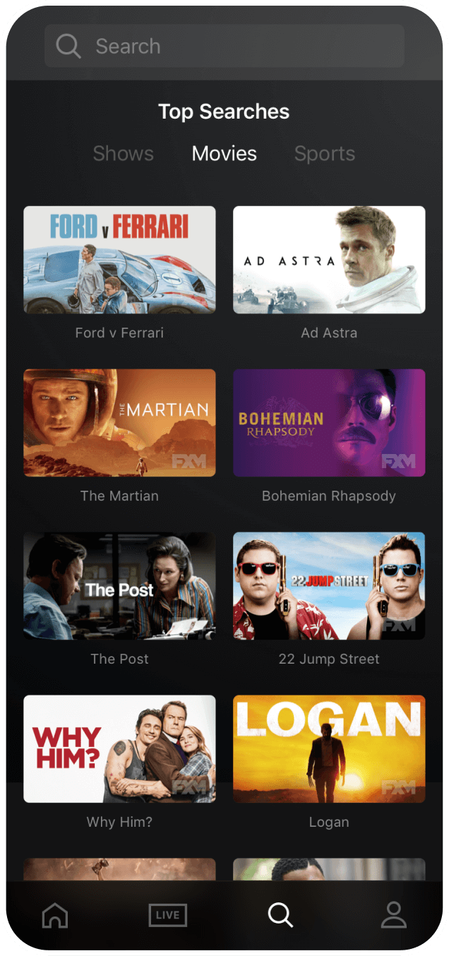
Users were unaware of where to input their search query, as the large search icon was often interpreted as a page header graphic rather than a tap area for input. However, this page also served as an alternative way to browse content, which was embraced by users due to the unfamiliarity of the old main browsing experience.
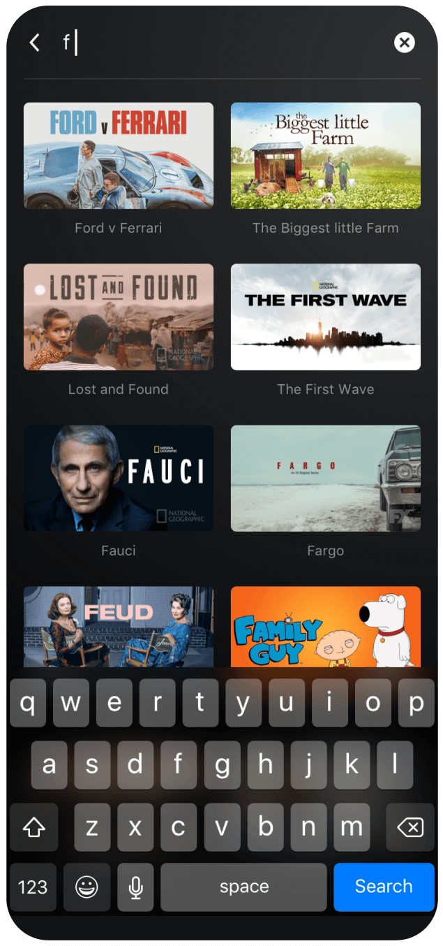
A traditional search input field was added in place of the large search icon, and the concept of "Top Searches" navigation tested well as a way to quickly surface popular content that users had been searching for that week. To improve content discovery, we also swapped show photos with key art images. Studios often invest heavily in promoting content through key art, and we found that users were able to find known content more quickly and were more likely to tap on new content as a result.
It’s important to note that the first iteration of this app was designed to satisfy the needs of four studios (FX, Fox, NatGeo, and Fox Sports), each with its own preferences for how their content should be browsed, displayed, and showcased. This led to a user experience that initially satisfied the studios, but not the end users.
Improving the user experience required not only numerous user testing sessions and numerous prototypes, but also close collaboration with studio heads to gain their support for the improved experience. As the studios wanted their content to be viewed, once we demonstrated that the new user experience could achieve this key performance indicator, the business case for the changes became clear.
The long-term solution delivered a customer experience that delighted our users. These improvements resulted in a 72% increase in total minutes streamed (year-over-year) and a half-star improvement in the App Store rating.